Streetscapes: The Art of Illusion
A collection of loose watercolour paintings
Streets have a great deal of power; they appear ordinary, yet they capture the spirit of culture and lifestyle. They are almost always bustling with activity that painting them gets overwhelming. There are too many people, moving cars and many such details that do not really need to be there in the painting. Street photographs are not always well-composed and painting with such references requires some composing skills. First of all, everything is not painted, many features are eliminated. Simplification is really an art which requires a lot of practice. A typical street painting should communicate the artist’s perspective. When simplifying, it is best to ask ourselves, what we find visually appealing and see where our attention is drawn to. What we notice is where our artistic style lies. We need not make the painting too complicated, we should keep it simple so that the viewer sees what we want them to see. Thus, to paint streets, we first need to learn to find beauty in the ordinary. (Read point no. 4: How to find a spot?)
I love how watercolour artists paint streetscapes with such a loose style that have less details and yet they convey a lot. I came across one such artist who also teaches and I decided to attend one of his workshops. Vanidas Mangathil is an Indian watercolour artist who also has a youtube channel where he posts narrative videos. I have attended a number of art workshops, the most of which have focused on technical concepts like perspective, composition, colour theory, and so on. These concepts are a must-know, yet I was still missing something. I could draw and paint properly, but I had no clue how to simplify. Vanidas’ approach was perfect for me since he didn’t emphasize on getting things exactly correct, but rather on getting them close enough. I learnt how to create an illusion and a disappearing feeling in streetscapes.
I'm going to show you some paintings that I made during lessons and practice sessions. As you scroll down, you'll notice that my skill set is expanding.
The first lesson focused on perspective. The following is not a real scene, it's an imagined one.
The goal of this painting was to learn how to paint with loose dry brushstrokes and simplify an image.
I personally loved this as I enjoyed painting human figures and so I added so many.
I practiced more to learn the art of simplication. I wanted to capture a Chinese street with these reddish-orange lamps. I could have simplified this further by blurring the last building with the background to create an illusion.

Chinese Street; reference image The reference image for this one was so complicated and ordinary, I have no idea how this turned out to be so beautiful. The art instructor also added a goat but I didn’t. I was satisfied with my painting and we should stop when we are. Knowing when to stop is also an art.

Kochi Street; reference image I'll admit it, Eiffel Tower in my painting is slanted like The Leaning Tower of Pisa. But, this is art, and it is going to be imperfect. That is the beauty of it. I wanted to capture bright light in this painting.

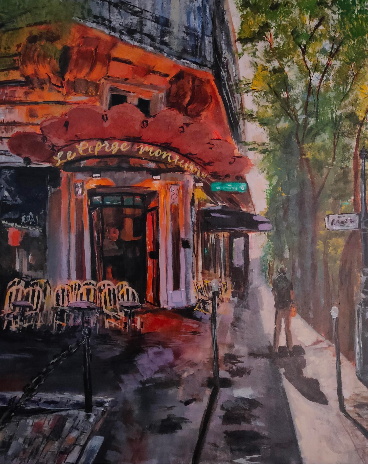
Luminuos; reference image The painting above (Luminuos) reminds me of a French cafe painting I made in acrylic a year ago. This painting is not at all up to the mark as there are a lot of perspective errors and muddy colours. I still have a special feeling for this painting because I was so determined to paint this French cafe in a loose style and it also helps me to see my progress and skill development over the last year. You can also check out a short process video for this.

French Cafe; reference image This is the last painting of the streetscape series and I really like how this turned out.
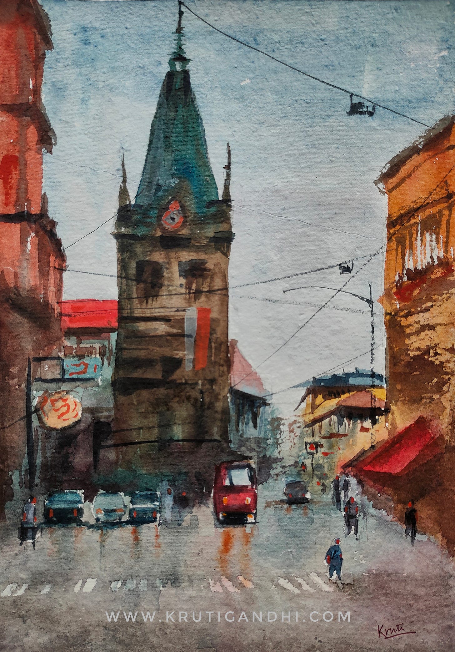
Note: I love the man I made with a bag on the left side.
Prague Street; reference image
Happy Creating.
Do you enjoy my work? Buy me a coffee!


